Is There Something I Should Know? (revisited)
It has become an ongoing custom for me between bursts of new material to go back and revisit and reedit older ones that perhaps were victim to overeagerness or the proverbial biting off more than I could chew syndrome. It happens to all of us. While I won't do everything I have ever done over again, I do readdress the ones that, at the time they were created, were high points for me, or at least ones that I feel worth improving because I still like the ideas in them.
This one was a high point when I finished it a little over a year ago. Not only was I happy with the outcome, I actually made another piece as a sort of sequel to it, which I plan to revisit as well. I have a warm spot in my heart for both of them, and even though I can look at them now and see things I would do differently, I still have both of them in my "personal favorites" collection.
It's also true that an artist tends not to look at the finished pieces once they are created, and to me, this image has been seen for a year at a thumbnail size if ever, and once I opened up the original file, I realized I had my work cut out for me.
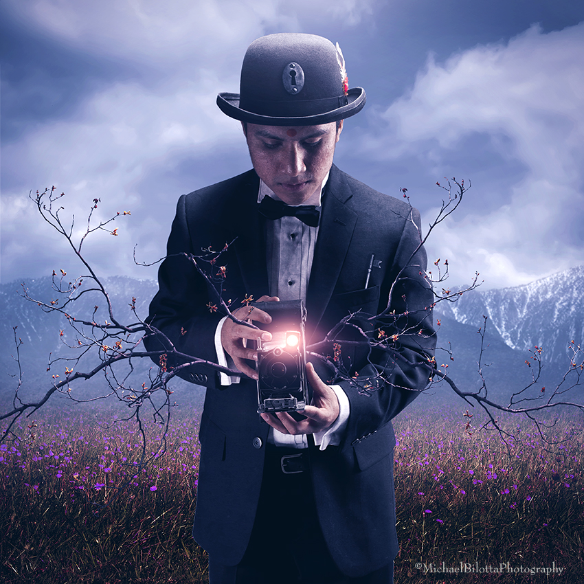
The idea was autobiographical and referential to my process of creating itself. I never know what I am shooting when I work with models - I improvise as do the models. Once I start editing, I try things with the shots until some ideas form. That is the essential concept of this piece - the artist, or photographer in this case, is searching for something, trying to find an idea in the wilderness, and shutting off his analytical mind and going on instinct or feeling to do it. It was about asking the piece, as it forms, "what are you trying to say?" The title of this piece was a somewhat sly reference to the song by Duran Duran - a boyhood favorite of mine, and the video gave my my first influential taste of Rene Magritte-inspired imagery. Since my model was dressed very much like characters in Magritte's work, and the fact that it was about trying to find an idea or a truth, I decided to call it "Is There Something I Should Know?" both as a reference to the song and video, and as an inner dialogue between me and this particular piece.
The original used the following objects as metaphors: a key, strings, a third eye reference, a camera, and ladders. A year ago I made several images using ladders, and when it came time to re-edit this one, I looked at them and to me they fell flat, not believable, and busy. I remember the original idea was that the ladders signified all the ups and downs, all the directions the editing process can take you, and it made sense to me that this character was making his way, or being guided through a field of ladders. The thing about the actual ladder though, is that it's hard to shoot. Most angles other than straight on are useless, as it hardly resembles a ladder except in that one angle. This field of stately ladders didn't work for me, using this year's eyes and sensibilities, so out they went.
The strings emanating from the third eye were also problematic. They didn't look terribly realistic either (even though they were!) and the fact that they were coming out of the man's forehead was mildly horrific, looking at it more objectively now. Out they went.
The key I liked, as keys open things, and that metaphor sits perfectly well in this concept. But, the key I used as horrible, and again, not believable. I think it may have even been clip art. I replaced it with a new key I got at an antique shop a few months ago. But, what to do about the third eye reference now that the strings are gone? I decided to add two items to support that concept: a keyhole and a bindi dot on the forehead. The bindi is obvious, and the keyhole on the hat gave more support to the key being there in the first place - the man has the means to literally unlock his mind, his imagination.
The original also had a powerful red light emanating from the camera, and this was a sort of tech touch to suggest the camera is guiding him as well. I still wanted that element in the revised version, but the lens flare in the original was overdone and way too strong. I modified it here.
That still left me with the element of the editing, the exploring process unaccounted for. With no ladders, I needed something else. I had some trees in the scene just in case, for filler, and I decided to move them to the camera and have them growing out of it. This solved my problem - now there was a connection to the camera and the creative wandering I had in the original. The trees represent growth and life, and they are growing wildly out of the camera here - it's unbridled creativity, and the man will have to learn to temper it, to control it, and to grow it further.
Once all that was in place, the rest was just some aesthetic choices - a few color changes to the flowers in the field and the buds of the trees gave it a slightly surreal vibe. I added a new, softer sky to the piece, and brightened up the image overall, This is supposed to be a cheerful mood, the warmth and hope of creating something. The original had a muddy, somber palette to it.
Lastly I added a mountain in the distance. Every piece I make has at one time or another felt like a mountain to climb, or find a way around!
I find myself in an unusual situation now - while this is a revised version of an older image, and indeed the idea and the model shot is the same, everything else is markedly different. It is almost a different image altogether, but the idea and the core is the same. I even toyed with giving it a new title, but in the end, the question posed by the title is still meaningful to the concept, and the song which shares it's name is still one I have great affection for, with it's vague, surrealist lyrics and Beatles-inspired riffs.
Last year the band featured the image on their Facebook page and it was a proud moment for me - thirty years since the song came out, to realize that the band actually saw my image that was, in part, inspired by them in the first place!
I have posted a Before and After version of this image on my website and on my Facebook page, with the old and new version side by side.
model: Gilberto Mendez


Karl Klanke 22. August 2014, 1:57
Very nice.Karl
AnitaJdS 21. Juli 2014, 23:03
me gusta mucho esta composition! Bonito!Erhard Nielk 24. Juni 2014, 17:46
fantastisch*** vg erhard